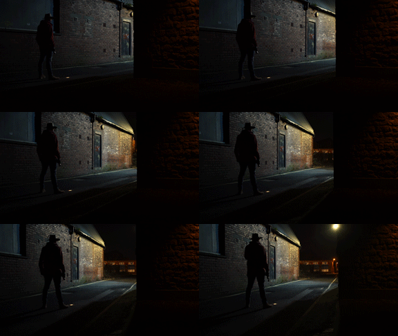
In this video, we are going to be breaking down the lighting setup for this shot, which we used in the last video about building up the tension in your film.
Let's start off by playing the whole scene.
First, we blocked out the scene to make sure the camera move would work in this location. We tried this shot a couple of different times during the day at two different angles.
The move is a track and pan and works best when you have a wall that obscures the audience's view from what the character can see. This helps us build up the tension in the shot and reveal what is there.
You can find a link right here to the video, that goes into a lot more detail about the camera move.
When we had everything blocked out, and it was dark. We could see what available light we had to work with. Our main source of light is this white LED street light; it’s a newer type of light than most street lights in the area, so it’s a lot more white than the typical orange bulbs.
We did need to add more light to the scene to bring up the exposure on our main character and fill the alley with a little more light.
To retain the direction of the practical street light and motivate it with more light, we would have had to rig a light up high to keep it consistent. Luckily for us, our studio window is right above the location and the street light.
This meant we could shine the light through the window, down onto the street and onto our actor. Matching the direction of the light makes it seem like it’s all coming from the street light.
The light we used is this NiceFoto HA-3300B set at 100% brightness which is a 330 watt LED or over a 2k light.
We will be reviewing the light in next week’s video so make sure you check that out.
We added a blue gel to the light to help it match the colour of the street light and a little bit of black wrap to help shape the light and stop it from shining onto the rooftops of the buildings opposite.
Next, we added a light onto this wall here, as at the current exposure it is completely black. So we took our Aputure hr672c light panel, attached it to a c-stand and boomed it around 10 feet high.
We set the colour temperature to 3200 kelvin and inserted an orange gel to give us a very vibrant orange light to make it contrast between our blue key light.
Then we added black wrap to the panel to cut the light into a sharp cone to mimic a street light and so it wouldn’t shine past the end of the wall.
We shot the whole scene on a handheld gimbal, using a Sony a7s Mark 1, with a 35mm lens. We shot with a daylight white balance with a ISO of 2500 and everything was shot at F8 to give us a greater focus distance as we could not pull focus whilst using the gimbal.
To grade the shots we used Lumetri in Adobe Premiere. We added contrast as the Sony standard picture profile has a flat look to it. We dropped the highlight brightness mainly for the wall which was closest to the light as it was too bright. Then dropped the shadows to create a greater vignette which helps lead our eye towards the light.
Next, we added the Fuji f125 Kodak 2393 LUT to help make it pop.
There is probably a reason it is called that, but I don't know what it is, so let us know in the comments below if you do.
We set the intensity to 20% as pushing any further would lose the essential detail in the image.
As you can see we only made slight adjustments to the image as the colour and texture of the walls give us a look that we already liked.
Finally, we added a 35mm course film grain to the image which we got from the the Emulsion pack from RocketStock. We tried a couple of the different film grains you get in the pack, but the 35mm coarse grain looked good for this image. Links to the emulsion pack can be found the description below if you want to check them out.
Also, If you want to watch more lighting breakdown videos we have a bunch on our channel. This one is all about how we used the Aputure 300d to light this shot. You can find that video here.
This video was Sponsored By
🚀 http://bit.ly/pack-emulsion - Make your video look like it was tailor-made for the silver screen with RocketStock’s film grain overlay pack, Emulsion!
🎵 http://bit.ly/pbtfl-glamourparty - Click here to download this episode's track. Check out Premiumbeat.com to discover a huge range of exclusive royalty free music!
DISCLAIMERS:
Some of these links are affiliate links, if you purchase gear via these links The Film Look will receive a small commission, but there will be no additional cost to you. Thank you!


