If there is one aspect of zero budget filmmaking that gets overlooked more than any other, I feel it’s art direction and production design.
I’m talking about costumes, set dressing, props, graphics; the things that give a movie life. These are things which contribute towards achieving the film look and will give your film a convincing visual identity and will embed it into your make-believe world. But art direction also serves a bigger purpose than just making your film look cinematic.
Today we are going to talk about how YOU can use art direction to help tell a better story by giving the audience visual clues on screen.
Today we are taking lessons we learned from shooting our latest short The Asylum Groove.
We were challenged to make a film with only a single word of dialogue.
With this in mind, we knew we would want to take advantage of cinema’s visual medium and use art direction to help tell the story, expose the universe, and give the audience clues as to when and where the film is set.
There are three main groups of art direction for a zero budget movie: You’ve got costume design, set design, and props. They all contribute something in their own way but all come together to create a fully fledged world.
First, lets cover costume.
The costume of your character, and the way they wear that costume, is a visual representation of their characteristics and their situation in the film. You can tell a lot about a character by the way they dress.
For The Asylum Groove, we wanted to use the costume as a way to give the audience the character’s backstory and to help him pop on screen, so we designed it in a few different ways.
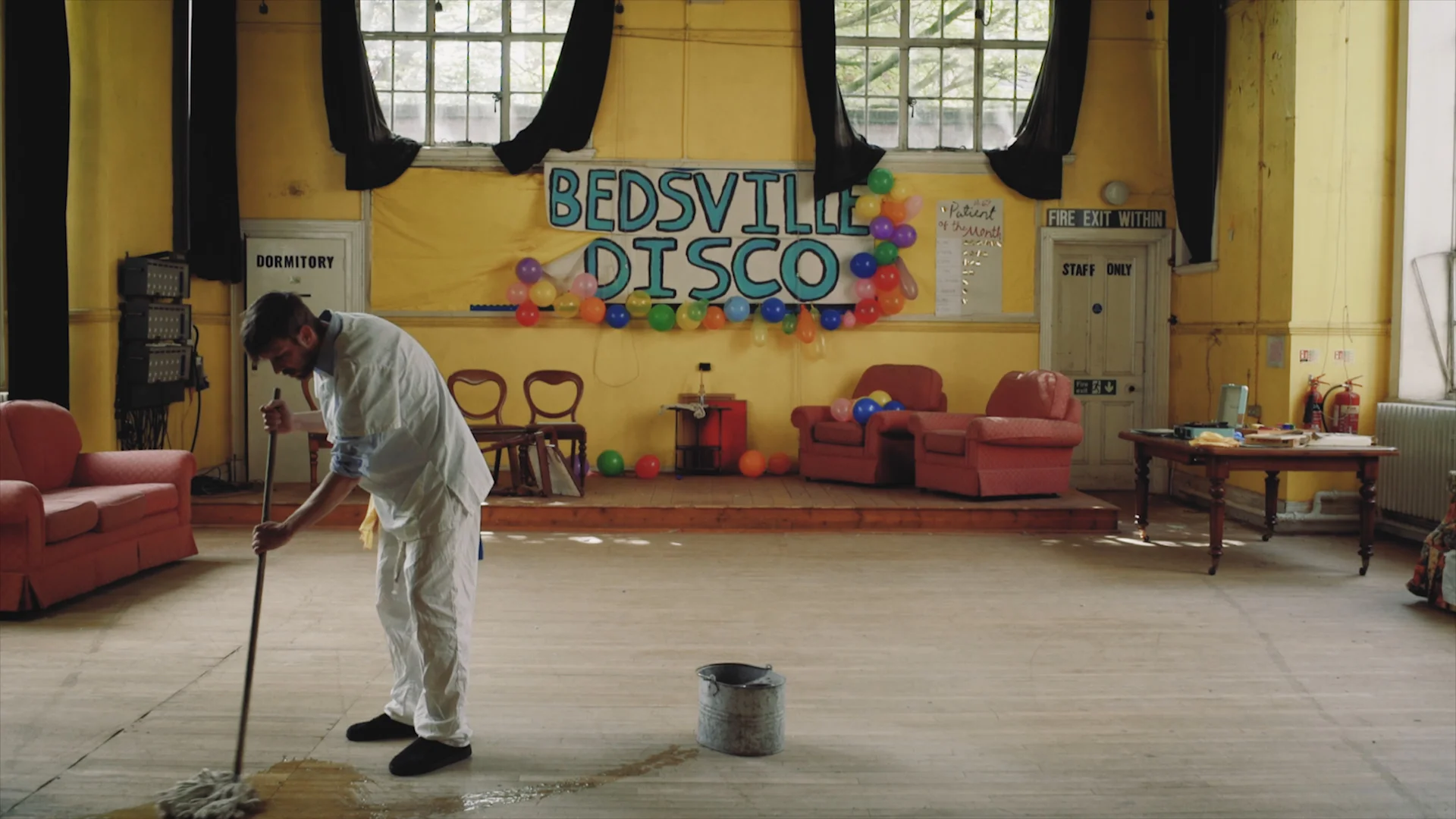
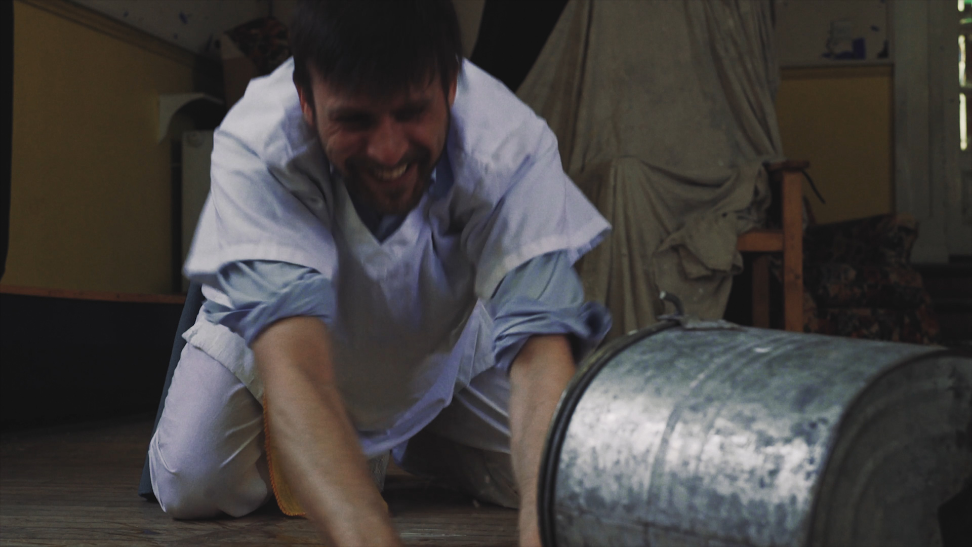
Firstly, ill-fitting white scrubs. Yes, this costume is also worn by a doctor, nurse, or a surgeon, but by making them worn, unironed, and stamped with a registration number, it would help give the impression that the scrubs are a mass produced, unkempt, mandatory uniform.
The creases and weathering also gives the costume some texture on screen, and as the scrubs are the brightest colour on screen, it also helps the character stand out from the background.
Costume design seems to work best when you give your costume a history or backstory. Most people don’t wear clothes that they’ve literally just bought that day, so think about your character, the types of clothes they would wear, and how long they have been wearing them before the moment the film begins.
The scrubs weren’t the only costume detail we added. His blue shirt underneath was to give the impression that he still retains some independence by wearing his own clothes underneath. This design also pays massive homage to One Flew Over the Cuckoo’s Nest, which this film is heavily inspired by.
We gave him cheap slippers which instantly negate any question that he might be a janitor or caretaker. The slippers also represent comfort and a relaxed attitude, so clearly he lives or stays in this location for a long period of time.
The last detail are the rags hanging from his waist and pocket. We included these for a few reasons. Firstly, it shows he’s cleaning. Secondly, having something long and hanging down helps compliment the energy of him dancing and spinning as it flows and lifts when he moves.
Next up we have props!
Props, and the design of those props, tell us about the character, the world, but most importantly, a prop is a totem of a character’s purpose in the story.
If you see someone flash a badge, you instantly think they are police or a detective, even without them wearing a uniform or saying a word.
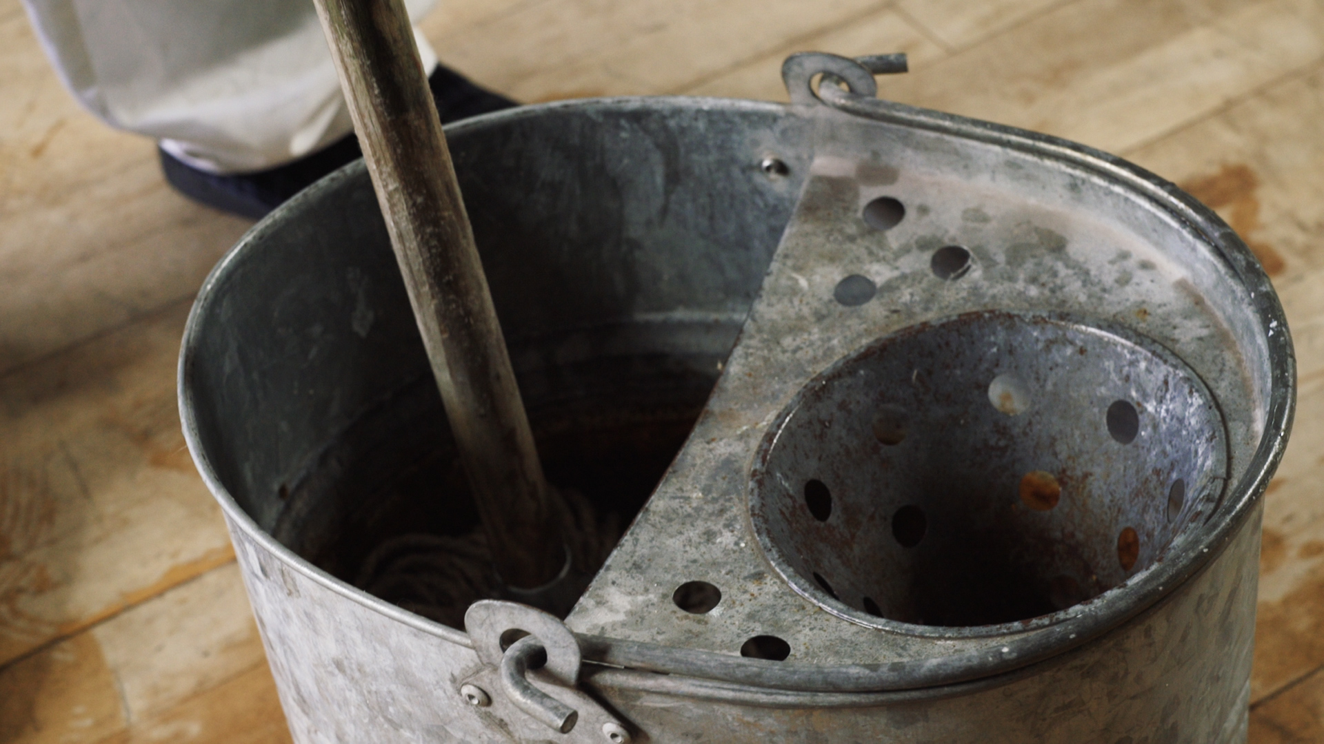
We wanted the audience to know within a few moments that our character had a job to do. So we gave him a mop and bucket. In terms of specifics, we wanted an old tin bucket.
This is a classic-look, and helps gives the film a pre-modern aesthetic. The mop needed to be old, dirty, and with a wooden handle, also helping set the film in the past and maybe even tell the audience that he’s been given sub-standard cleaning supplies for his job.
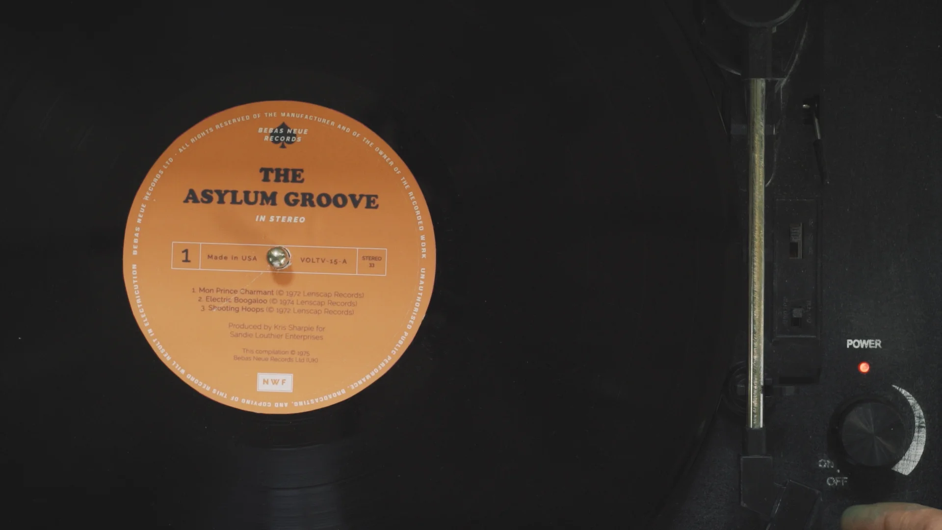
The last major prop in the film was the vinyl record. From the get-go we knew this film would involve dancing to an old-school song. We wanted to help place the film around the 1970s, so we took an old record and designed, what we thought, was the most 70s label as possible: orange background, groovy disco font, and a simple design without anything super fancy in terms of graphics.
This prop was also designed to be used as the title of the film, so we knew we wanted it to look as genuine as we could. Last up, we have set design!
Set design is arguably the hardest part of art direction for an indie and zero budget filmmaker. Whereas things like props and costume are usually quite small and personal, creating a convincing set (depending on the film you are making) is a mammoth task, but if done right, can be a powerful provider of clues to the audience about the world, the period, the state of the location, and the character’s situation.
We cheated a little bit with the set on The Asylum Groove: we actually wrote the script around the pre-existing location. We knew of the school assembly hall before we were even given the one word challenge, and we knew we wanted to use it for a film about people in an insane asylum.
The location was already old, worn, dirty, and had the most horrible bright yellow walls. Instead of trying to convert it into something completely different, we used the location as the basis for the script and embraced the old, grimy look.
Building a world around an interesting looking location you already have access to will give you an easier job of creating a convincing set and also save you a lot of money.
If there was one thing we wanted to tell the audience without OUTRIGHT telling them, it was WHY the character was cleaning. His reason for mopping isn’t necessarily a major plot point, but giving the character a true purpose on screen helps the audience settle into the film and not question it from the very first frame.
If the audience had to ask “Why’s he mopping?” at the beginning of the film, it just means we didn’t give the audience enough clues to his situation.
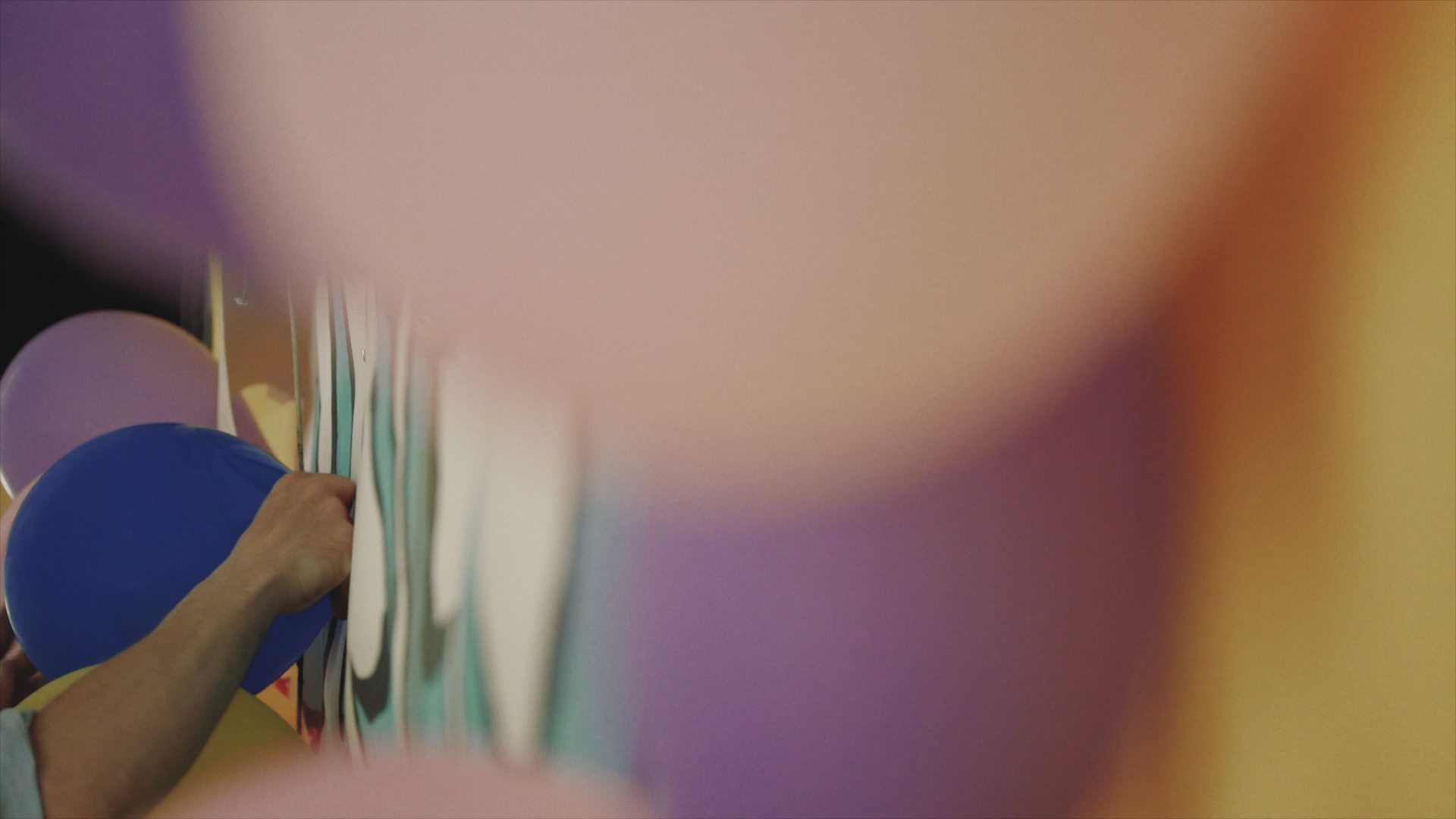
So we added a banner and balloons onto the back wall with “Bedsville Disco” painted on. We deliberately made a poor job of he back wall, the banner is falling off and the balloons are not even finished. This was to give the audience the impression that the disco wasn’t a glamorous affair, and would fit closer to the derelict hall we had access to.
We added small details such as signs on the door with “dormitory” and “staff only”. We actually took these from the set of the One Flew Over the Cuckoo’s Nest stage play.
Colour design was another thing we wanted to focus on with this film. Because of the bright yellow walls of the assembly hall, we knew we could use yellow’s complementary colour, BLUE, as an accent colour for the character and as a visual device to lead the audience's eyes.
This is why we picked a blue shirt, blue paint on his hand and the brush, a blue balloon placed on the wall, a bright blue record player, and blue nail varnish for the mother at the end. We wanted everything he interacted with to be blue.
One last we did was take advantage of the furniture left over in the room. The chairs and sofas were already there, so we placed them in a way which we left created a vacant audience for the character to dance to.
All of the furniture points in the direct of the character, and the angle of the chairs on stage actually point directly towards the framing of the execution, foreshadowing the audience viewing of the execution at the very end.
Not a hugely important detail, but we thought it could be a cool little bit to add in and maybe, subconsciously, it would add something to the storytelling.
We even included the execution chair in the background after the moment the character snaps back into the reality when he trips over the bucket.
Obviously this is only our experience of art direction so far, and we have a lot to learn.
With this film, we suddenly realised how powerful of a storytelling device art direction can be. It can reduce your dialogue, give your audience visual hints towards the story and the world, and there’s no denying a great-looking set makes your film look a hell of a lot more cinematic.
A picture is worth a thousand words, and we as filmmakers should take advantage of that.
This video was Sponsored By
🎵 http://bit.ly/pbtrack-links - Click here to download this episode's track. Check out Premiumbeat.com to discover a huge range of exclusive royalty free music!
DISCLAIMERS:
Some of these links are affiliate links, if you purchase gear via these links The Film Look will receive a small commission, but there will be no additional cost to you. Thank you!


