Today we are talking about how you can actually make things look more cinematic by adding some mess to your set.
We’ve been watching the latest season of Stranger Things and we’ve been inspired to create something that gives off a messy, lived-in, retro vibe. Let’s break it down.
We began with the bare essentials of the scene. In the script, it reads:
“Rob is sitting playing video games”.
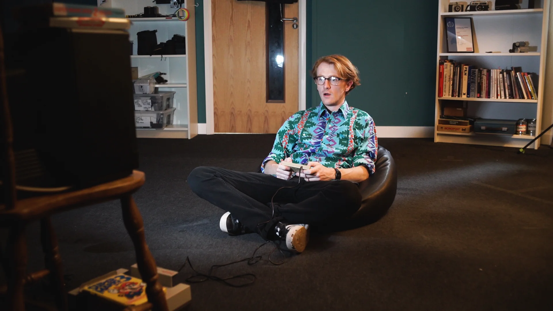
So we grabbed Rob’s NES, we hooked it up to an old TV, and sat him down on a beanbag.
But clearly, there is something missing from this scene. The shooting space is just too bare. It doesn’t look real. There’s not enough stuff!
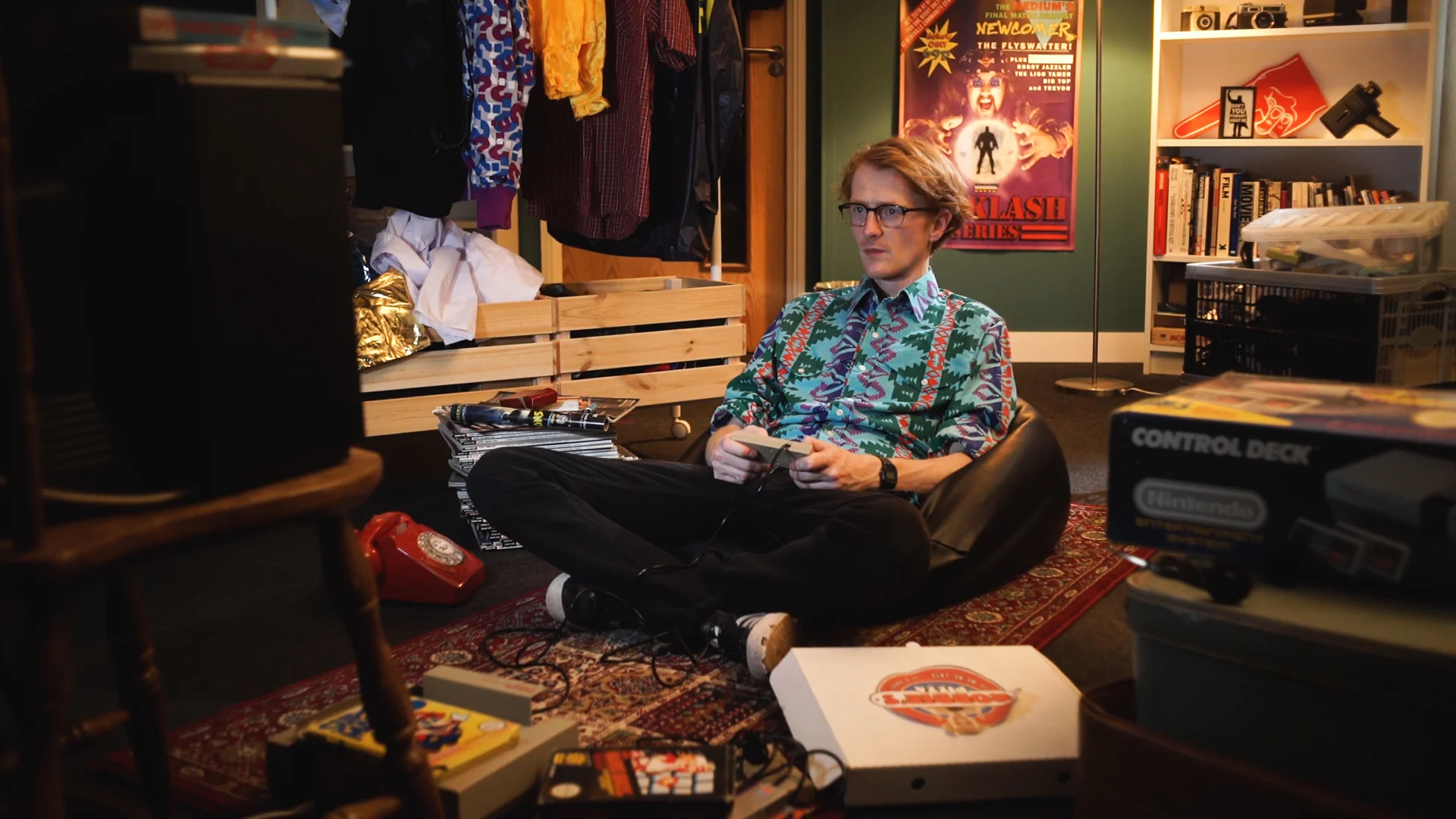
So we grabbed everything we had which looks old, retro, and domestic, and started layering things into the frame, starting with the background.
The bookshelf is a good start already, but we re-arranged the visible shelves, placing a foam finger, a super 8mm camera, and a picture frame from The Breakfast Club, making the shelves look a bit more informal and hitting that 80s vibe.
Then we needed to put something on the bare wall. We grabbed a poster from one of our films, Backstage, and stuck it up. Thankfully, the poster is already designed to look like it’s from the 1980s, so this was an easy one.
We popped a floor lamp in the background to light up the poster and bookshelf, and it also comes in handy for the lighting setup.
More on the lighting setup down below!
Lastly, we needed to hide the door to our editing room. So we wheeled over our costume rail and literally just placed it in front of the door.
We decided to bring the costume rail into the mid-ground on an angle. This closes the space a bit more, making it feel cosier.
We also piled up some plastic crates on the other side of the subject. This fills the space, but it also hides the extension cable and the light stand in the shot.
If you are struggling to keep your equipment out of shot, the next best thing is to hide it with props and set dressings!
We had a pile of magazines laying around so we threw them into the frame (from a distance they look a bit like comic books), and we even topped the stack of magazines with a few old cigarette boxes to make it feel even more lived in.
We placed in the phone, a necessary prop in the script.
The last mid-ground set dressing was a Persian rug. We wanted to give the floor some colour and texture, so this worked really well.
In the foreground, we had the TV on one side, so we placed in a stack of old suitcases, and an NES box on the other side to give us a natural vignette and a nice frame to shoot through.
We included a pizza box, and we stacked up the NES game boxes and another controller for even more mess.
Obviously, when you dress a set for a film, everything you pick should relate to the character, story, or scene. We have an episode on that:
Next up, we have the lighting.
Our key light in the scene is from the old TV. In order to manage the exposure levels, we motivated that light with a small LED FX light, set to a slow pulse. We set the exposure levels to the 70 range on the subject’s skin when the light is at its brightest.
That practical floor lamp we placed in the background earlier meant we could add a few extra sneaky productions lights into the scene using the floor lamp as the motivating source.
We used an Aputure Mini 20 to give the subject a hair light, and we pointed our Astora LED panel towards the ceiling to bring up the ambient light in the scene.
Floor lamps are great to place in a scene if you do intend to bounce light off the ceiling because the direction of the light between both sources looks very natural. If you do add light into a scene, it’s always better to accompany it with a practical source to ground it in reality. Think to yourself “Where is this light coming from?”.
This video will show you how adding more mess and clutter into a frame can actually make it look more cinematic. By the end of this video, you will have an understanding of what you will need to dress your sets to gives your movies the film look.
📺 How to support the channel
🚀 bit.ly/artlistfilmlook - The music you heard in this episode is from Artlist. Click the link to receive 2 extra free months on when you purchase an Artlist subscription!
🎵 https://www.joelfamularo.com/colour - Use discount code "TFL" at checkout to get 20% off your LUTs purchase!
🎬 In case you missed it
How to use the 30 Degree Rule: https://youtu.be/Sud_wMH7L18
Backstage BTS: https://youtu.be/tSBta8DFwww
Action Hero Entrance: https://youtu.be/5C05jf4VQTU
Get the Film Look with Art Direction: https://youtu.be/6AUmcvAyTKU
How to Use False Colour: https://youtu.be/nncazai0Ei4
🎧 Listen to our Podcast!
iTunes: https://goo.gl/hikhGF
Android: https://goo.gl/fmsp4s
📞 The Socials
Website: http://thefilmlook.com
Twitter: https://twitter.com/TheFilmLook
Facebook: https://www.facebook.com/TheFilmLook
Instagram: https://www.instagram.com/thefilmlook
DISCLAIMERS:
Some of these links are affiliate links, if you purchase gear via these links The Film Look will receive a small commission, but there will be no additional cost to you. Thank you!


